< Design < Archive < Wikimedia Foundation Design
This was a work in progress
This page describes guidelines around whitespace, alignment and visual hierarchy within projects run by the Wikimedia Foundation.
Some components have been redesigned in order to validate and test the color palette and proposed type standards.
These components are by no means prescriptive, they are meant for suggestions and validations.
Infobox modules (Appear in the rightmost column of wikipedia pages)
Issues with current infoboxes
- Centered alignment which creates a very chaotic reading experience because of rags on both left and right side
- Haphazard spacing between lines which creates unclear groupings
- Arbitrary color fills used as backgrounds for the group headings
- Suggestions for infoboxes
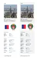 Left: Left Aligned
Right: Left Aligned with background fill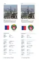 Left: No Vertical Rule
Right: Use of Heading Fills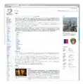 In Context View
Special Pages Feed
This is not meant to extend functionality or interaction in the component, it is merely a visual design exercise.
- Validations using Page Triage
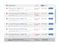 Validation of our color palette using Special Pages Feed Component
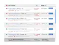 Page Triage Table. Header contains light drop shadow
See also
This article is issued from Mediawiki. The text is licensed under Creative Commons - Attribution - Sharealike. Additional terms may apply for the media files.