< Mobile design


.png.webp)
.png.webp)


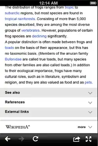
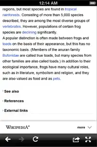
Option A Section toggle with lines and right-side arrows

Option B Section toggle with alternating stripes and right-side arrows
.png.webp)
Option C Section toggle with gradation.
.png.webp)
Option C Section toggle with gradation expanded.

Option D Section toggle, tiny left-side arrow and lines.
This document describes the design of the section header and toggle for the developing Wikipedia Mobile site.
Rationale
The current mobile section headers do not fit within the concept of a minimal design.
Goals
- Ongoing effort to implement a UI step between the current interface and Glaucus/Athena
- To make interaction simple, smooth and intuitive.
- To make section toggle visually obvious to the user but keeping a minimal design.
User testing
Two user tests of the section heading style with down/up arrows are documented here.
- One is on iPhone and one is on Android.
- Both users clicked on the down arrow without hesitation.
- Both users found the opening and closing of sections to be intuitive.
- The iPhone user complained about not being able to scroll quickly through lengthy articles, and clicked on "Jump back a section" and then collapsed the section.
- The Android user suggested other icons for expanding collapsing, such as +/- and arrow pointing right/down.
This article is issued from Mediawiki. The text is licensed under Creative Commons - Attribution - Sharealike. Additional terms may apply for the media files.